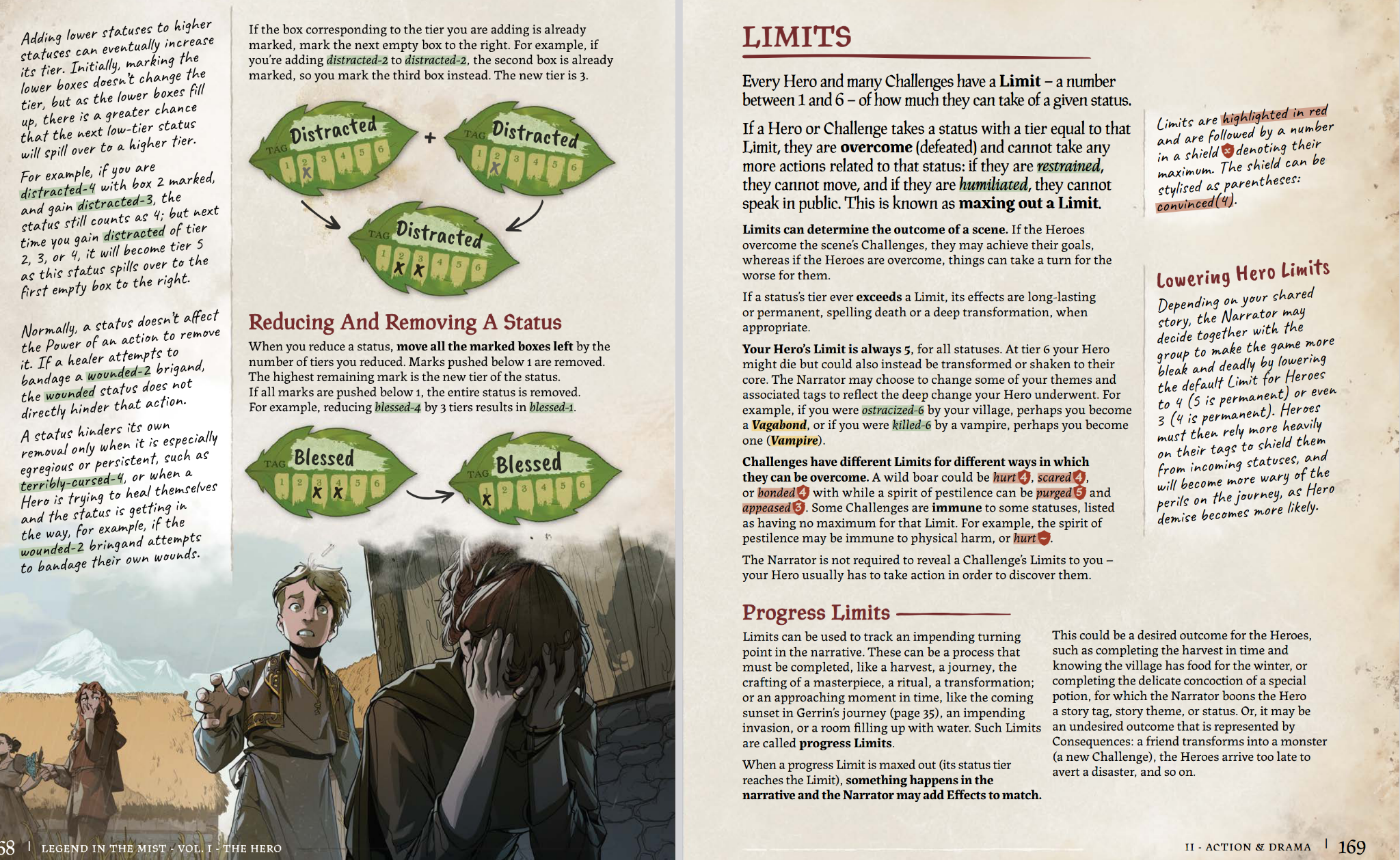
If we want to talk about just like ... the most suffocating formatting imaginable, the one that took the cake tonight is Legend in the Mist
-
If we want to talk about just like ... the most suffocating formatting imaginable, the one that took the cake tonight is Legend in the Mist.
Like: Just look at this. Look at it! Diagrams, symbols, colors, sidebars (at an angle AHHH), and multiple fonts and sizes. The whole thing is a suffocating mess. The art really captures my emotion trying to parse this.
It's artsy as hell. The artwork is great. But what trainwreck of usability.
#TTRPG
This page isn't special, by the way. The whole thing is like this.
-
If we want to talk about just like ... the most suffocating formatting imaginable, the one that took the cake tonight is Legend in the Mist.
Like: Just look at this. Look at it! Diagrams, symbols, colors, sidebars (at an angle AHHH), and multiple fonts and sizes. The whole thing is a suffocating mess. The art really captures my emotion trying to parse this.
It's artsy as hell. The artwork is great. But what trainwreck of usability.
#TTRPG
@NullNowhere Stark contrast to those very early TTRPGs like D&D. They look so lacking in design and all sorts of things.
But I think they had more magic.
-
@NullNowhere Stark contrast to those very early TTRPGs like D&D. They look so lacking in design and all sorts of things.
But I think they had more magic.
@yon@sakurajima.moe Some people still get it. As an example I listed elsewhere, Most of Kevin Crawford's books are pretty consumable, some even thread the art needle very well, and have files without art for those who want them.
A book who's presentation I really enjoy as well is The Burning Wheel. The system is a bear to grasp, but visually, it has a tasteful and unstated style that really appeals to me. Its art isn't bombastic, but the whole thing is a comfort to hold and read through since it feels like a book, and not a coffee-table accessory. -
@NullNowhere Stark contrast to those very early TTRPGs like D&D. They look so lacking in design and all sorts of things.
But I think they had more magic.
@yon@sakurajima.moe There has been what feels like a decided shift in production culture. The visuals of a book have really grown in importance to a consumer, and a lot of people do buy the book for aesthetics.
MÖRK BORG is an example. If you love like, hardcore metal album covers, the game is a joy to view and sold well on that alone. The text is so over stylized though that it takes a LOT of squinting to try to read and run, even though the game itself is very simple. The art is just hostile to function.