@letterror you are—absolutely—right
amalie@typo.social
@amalie@typo.social
Posts
-
If a meeting agenda is written by AI, is it acceptable to send an AI summary as a token of my attendance? -
Did anyone make that “what Monotype swallowed” history chart yet?—We have a class of design students visiting today, and this might be a good talking point.—Cc: @tphinney @kai @typeoff @underwareyeah, it is a bit tricky to define. I would count “Neue haas grotesk” as an Helvetica, but would Arial or “Swiss” count as clones? What is the line or would define as a “revival”, “clone”, “official”, etc.
-
Did anyone make that “what Monotype swallowed” history chart yet?—We have a class of design students visiting today, and this might be a good talking point.—Cc: @tphinney @kai @typeoff @underware@alvaroefe @typeoff @underware @tphinney @lttrspc @typographische @kai I wonder what the top typefaces are besides Helvetica which get an enormous amount of releases. Garamond and the not-really-Garamonds? Times (New) Roman? Bodoni?
-
I climbed the tower of the Nieuwe Kerk in Delft and saw this funky and oddly gorgeous degraded lettering@veryrobin potentially, but it’s also inside a church
-
I climbed the tower of the Nieuwe Kerk in Delft and saw this funky and oddly gorgeous degraded lettering@veryrobin they didn’t originally look like that but more like the letters below. If you zoom in you can see that the letters have similar but unique degradations. I’m not sure what caused it to weather like that however.
-
I don't know if this is on purpose but that's an interesting way to leverage a variable font for web -
I don't know if this is on purpose but that's an interesting way to leverage a variable font for web@justvanrossum @eWalthert @letterror @faux_icing @koeberlin I’m not sure. Drawbot feels like the type of software that uses it own font renderer or a consistent library for that is the same across all OSes like freeType.
-
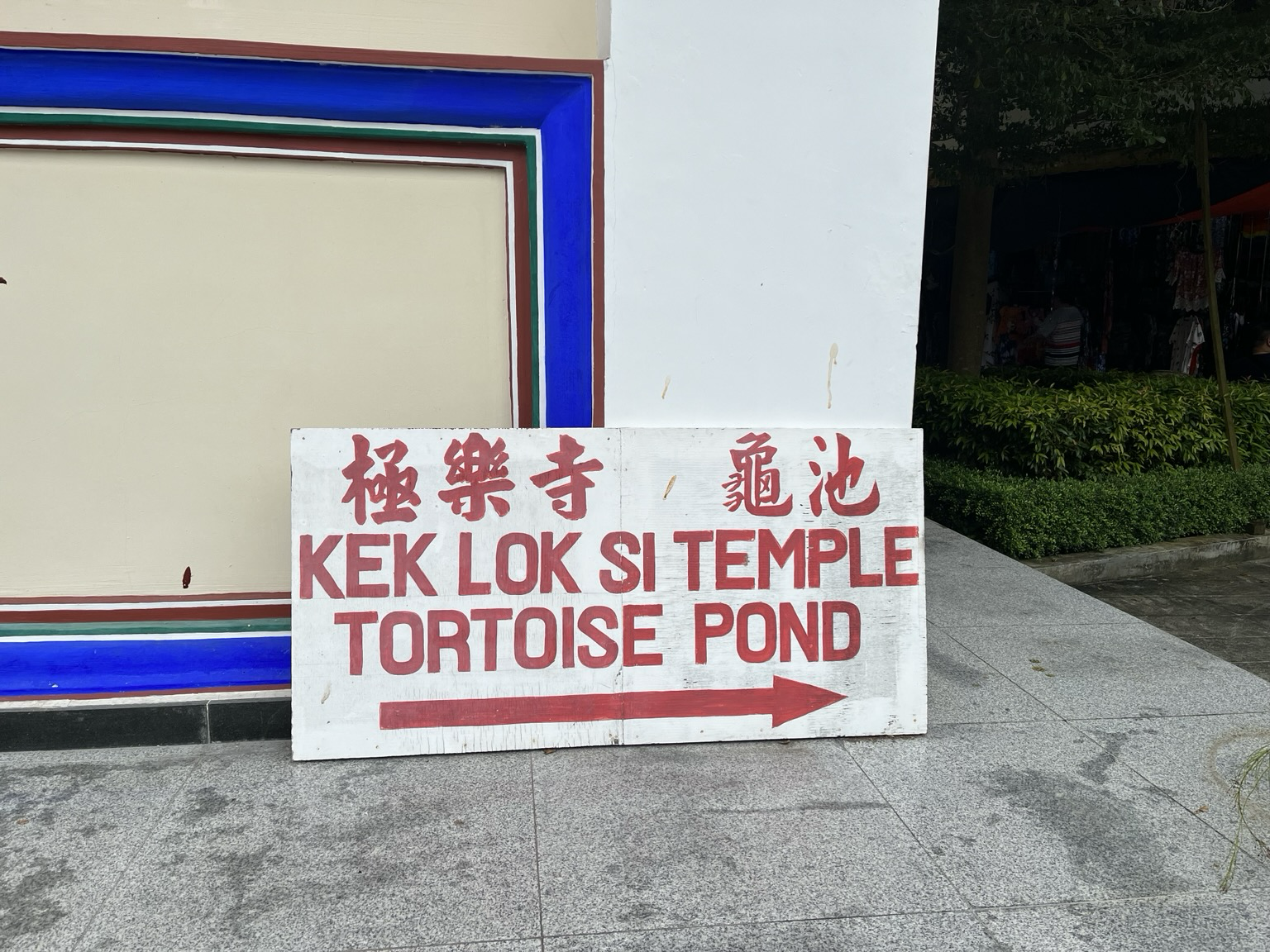
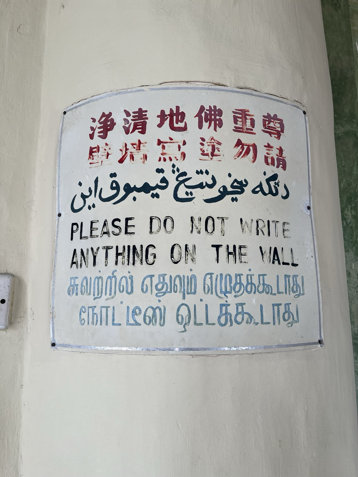
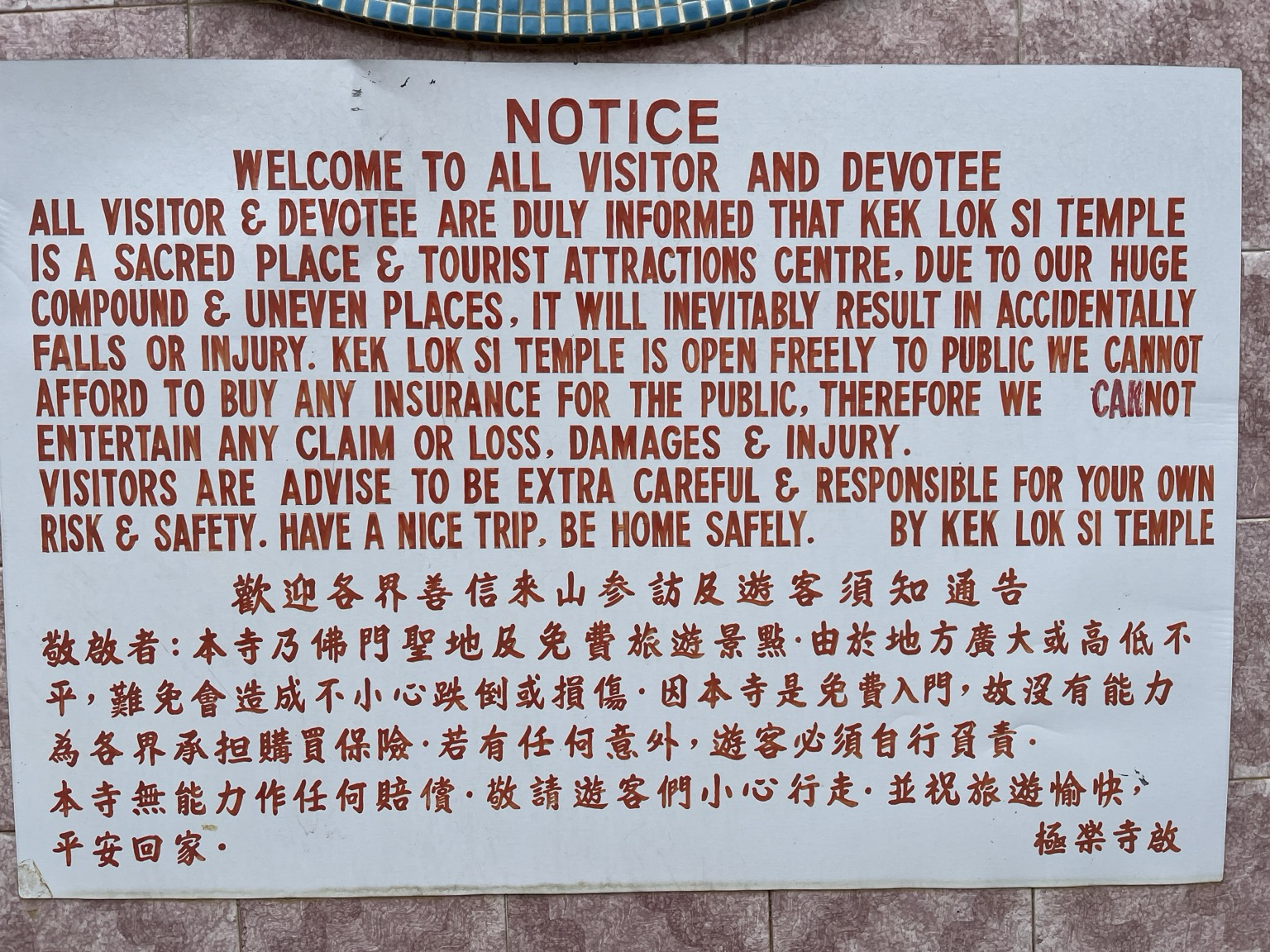
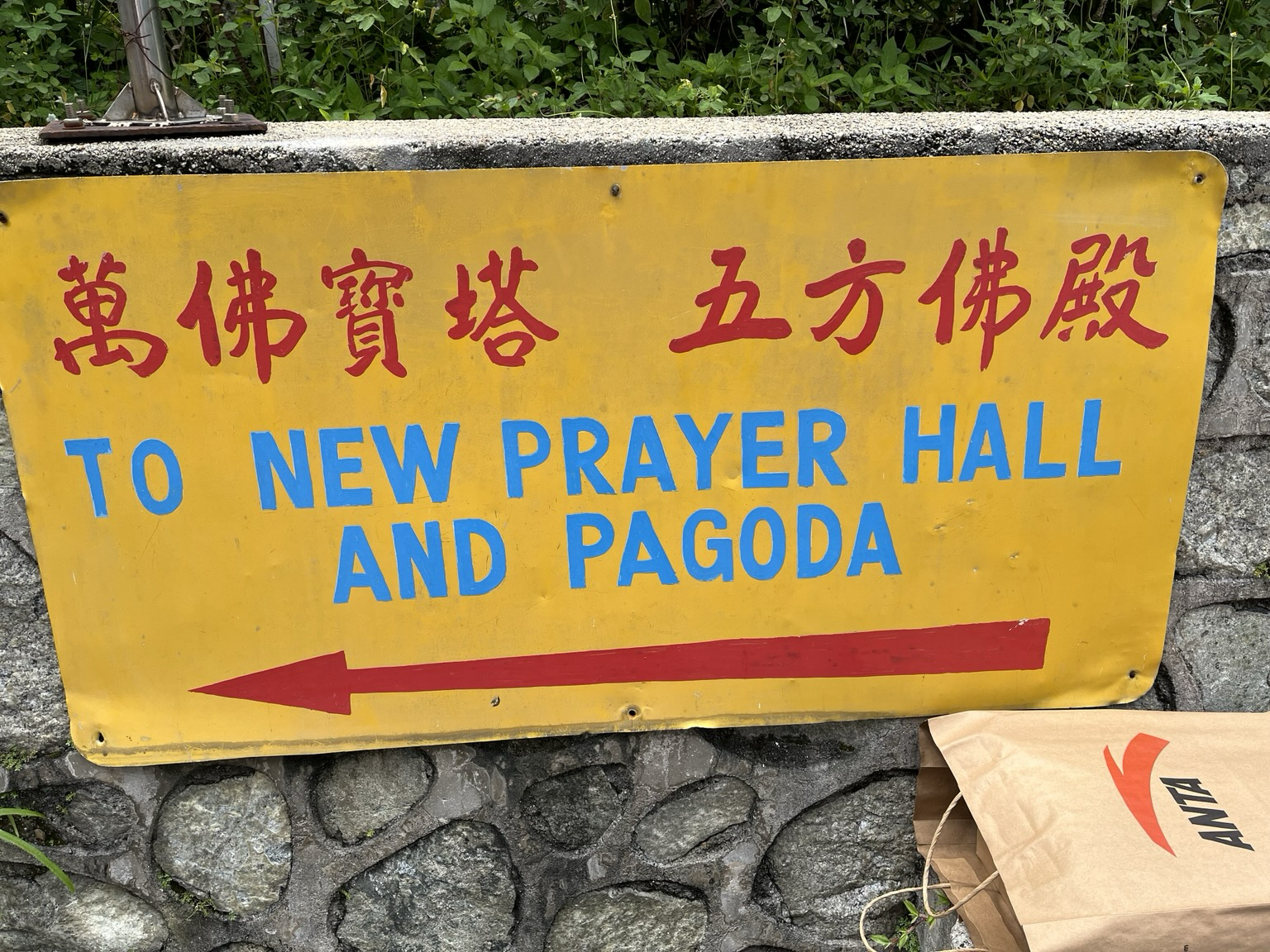
I visited Penang, Malaysia a few years back and found some imperfect but surprisingly good hand painted utilitarian signage in a temple:I visited Penang, Malaysia a few years back and found some imperfect but surprisingly good hand painted utilitarian signage in a temple:
-
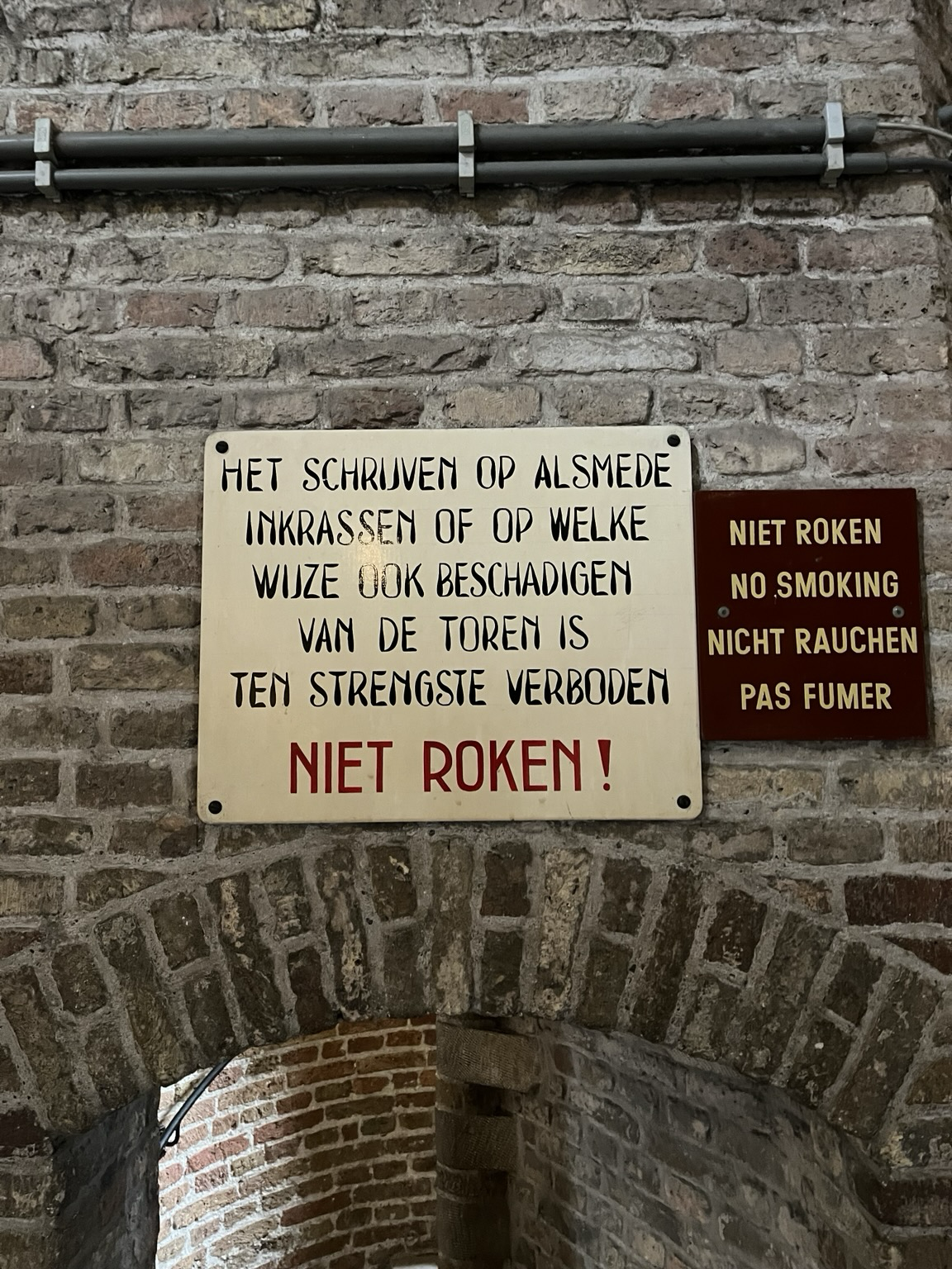
I climbed the tower of the Nieuwe Kerk in Delft and saw this funky and oddly gorgeous degraded letteringI climbed the tower of the Nieuwe Kerk in Delft and saw this funky and oddly gorgeous degraded lettering
-
#introduction Glad to finally be on Mastodon, where all the cool type kids seem to be!#introduction Glad to finally be on Mastodon, where all the cool type kids seem to be! I guess I can start out with a typography joke I made up many years ago: “Helvetica walks into a bar and sees Arial and immediately accuses them of being a copy. Arial responds with, ‘It wasn't my fault! It was just an Akzidenz!’”