@juergen_hubert@mementomori.social I got curious so I decided to generate the graph. Here's that graph for the bottom 20%, from the data above.
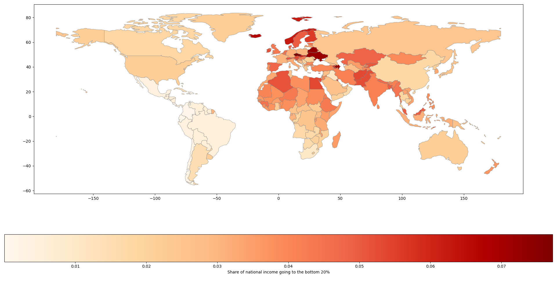
@juergen_hubert@mementomori.social I got curious so I decided to generate the graph. Here's that graph for the bottom 20%, from the data above.
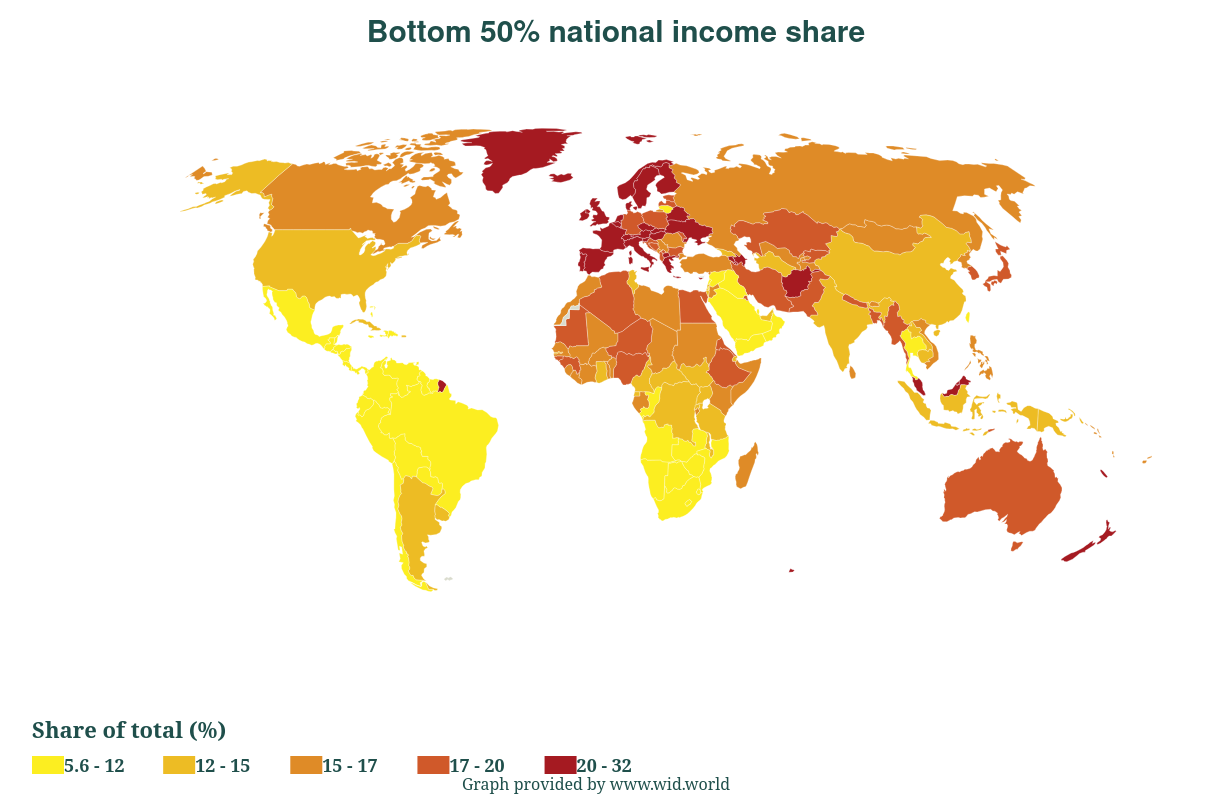
@juergen_hubert@mementomori.social The World Inequality Database might have the info, but the only graph available shows income at the bottom 50% - https://wid.world/